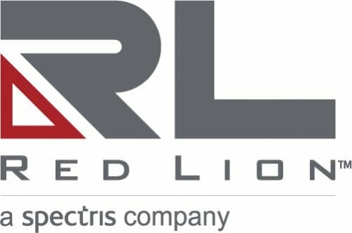
Red Lion Controls, global experts in communication, monitoring and control for industrial automation and networking, announced today a new brand identity that reflects its strength and positioning in the market.
The new brand identity reflects Red Lion’s continuous advancement to deliver tailored solutions that help customers achieve operational excellence.
“I am excited to announce a new era for Red Lion, one that begins with a brand new look and delivers greater innovation and value to our customers than ever before,” said Jack Lee, Red Lion President. “While our look is changing, the strong values that made us who we are today will remain. I am proud of Red Lion’s legacy, yet eager to redefine our commitment to excellence.”
The meaning behind the logo and tagline
Red Lion embodies stability and strength in the market, as well as excellence in customer service. Designed to evoke the same experience, only visually, the new Red Lion logo focuses on the initials – RL– for easy recognition.
Titanium Grey as the primary color of the logo emulates strength, while a red triangle represents geometric stability and maintains Red Lion’s legacy color.
The Red Lion brand stands for excellence at every touchpoint through its products, solutions and service. The tagline “Excellence. Redefined.” reasserts the high standard of performance and integrity that defines Red Lion and the continual mission to provide greater business value to customers.
Over the next few weeks, Red Lion will roll out its new brand identity over traditional and digital outlets.


